Exhibition: „Eat, Drink and Draw“ – HSUAN-WEI CHEN & HOJEONG LEE
From 27th April till 8th July 2024 the fascinating artworks of HSUAN-WEI CHEN aka JAJA and HOJEONG LEE could be admired in the exhibition “Eat, Drink and Draw” in the NORDHEIMER SCHEUNE. In this article here you will see several of their interesting creations from the duo exhibition in Nordheim, which is a beautiful village located between the cities Heilbronn and Stuttgart.
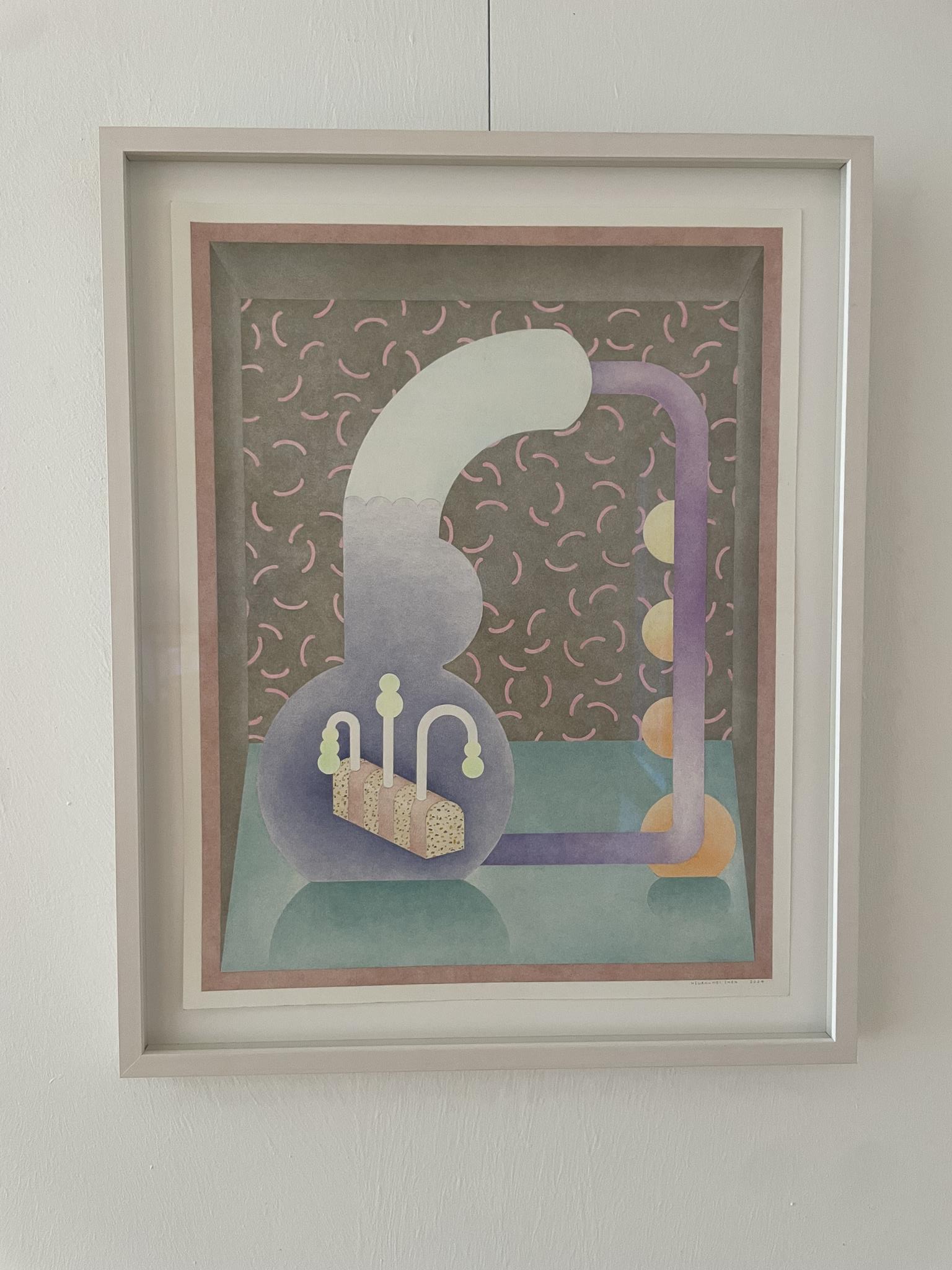
Curator HELMUT ALBERT MÜLLER about the exhibition: Born in Taipei, Taiwan in 1986, Hsuan-wei Chen, a graduate of the master’s program for jewelry, silversmithing and related productions at Birmingham City University and master student of Sophie von Hellermann at the State Academy of Fine Arts in Karlsruhe, who is called JaJa by her friends, and Hojeong Lee, a master student of Karlsruhe rector Marcel van Eden who was born ten years later in South Korea, agreed on the title „Eat, Drink and Draw“ following my invitation to the Nordheimer Scheune and wrote the following to me on 30. September 2023: „As we are two draughtswomen, our main concern is to recall the importance of drawing. The daily practice of eating, drinking and sleeping is strongly connected to both our works. This can also be seen in JaJa’s vases and Hojeong’s drawings, which are characterized by the influences of everyday conversations. The title can be in either German or English“.
In their explanation of their title, JaJa and Hojeong allude both to the traditions of drawing embedded in the cultural history of mankind and to its everyday nature, which we know from children – and I quote: „When children of pre-school age draw their everyday world, the houses have crooked roofs, the people painted sometimes have far more than five fingers on each hand, while the sun shoots rays reminiscent of an aggressive porcupine. A sense of spatial depth and perspective does not yet exist. Nevertheless, enthusiastic parents usually understand every detail, ‚every word‘ of the picture. Even if dad has 27 fingers in the picture, he can easily identify himself. The adult viewer can therefore abstract. And we also quickly recognize the sun in children’s pictures, no matter how scribbly and imaginatively it has been painted. The main thing is that it is yellow, has rays and is at the top of the picture.
Then the yellow spot corresponds to the inner pattern image that we have created of the sun – we recognize the sun in the picture without seeing the real sun“. The 40,000-year-old hunting scenes in the Spanish El Castillo cave and the five-thousand-year-old depiction of warthogs in the Leang Tedongnge cave on the island of Sulawesi in Indonesia, which are being pursued by human-like creatures, are remotely reminiscent of pictograms that convey information in the form of simple pictorial representations without additional text and which anyone can understand regardless of language, culture and individual experience. Cuneiform writing emerged from simple pictorial representations in the Sumerian cultures in the third millennium BC and the first alphabet emerged from cuneiform writing in Ugarit around 1500 BC.
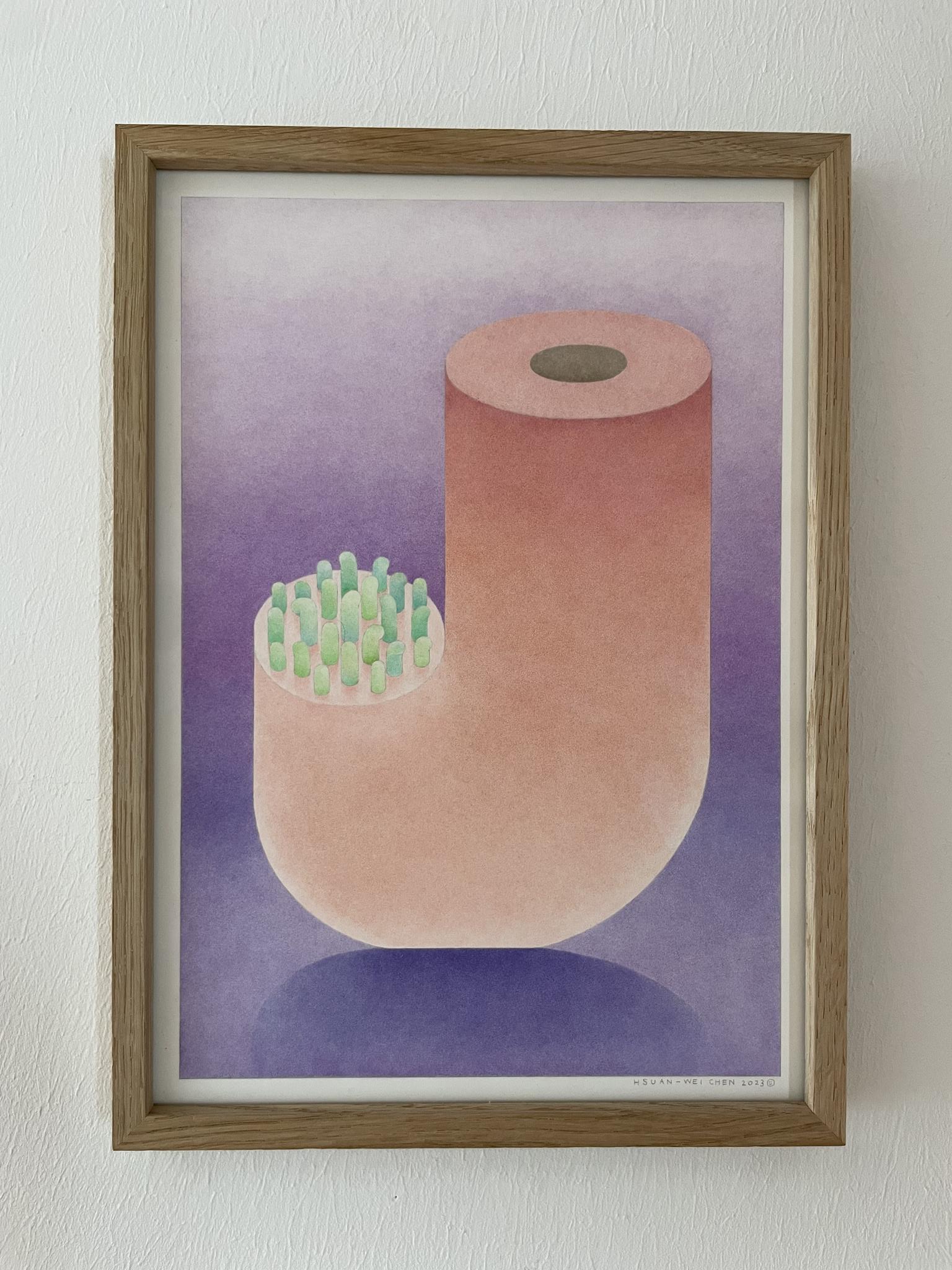
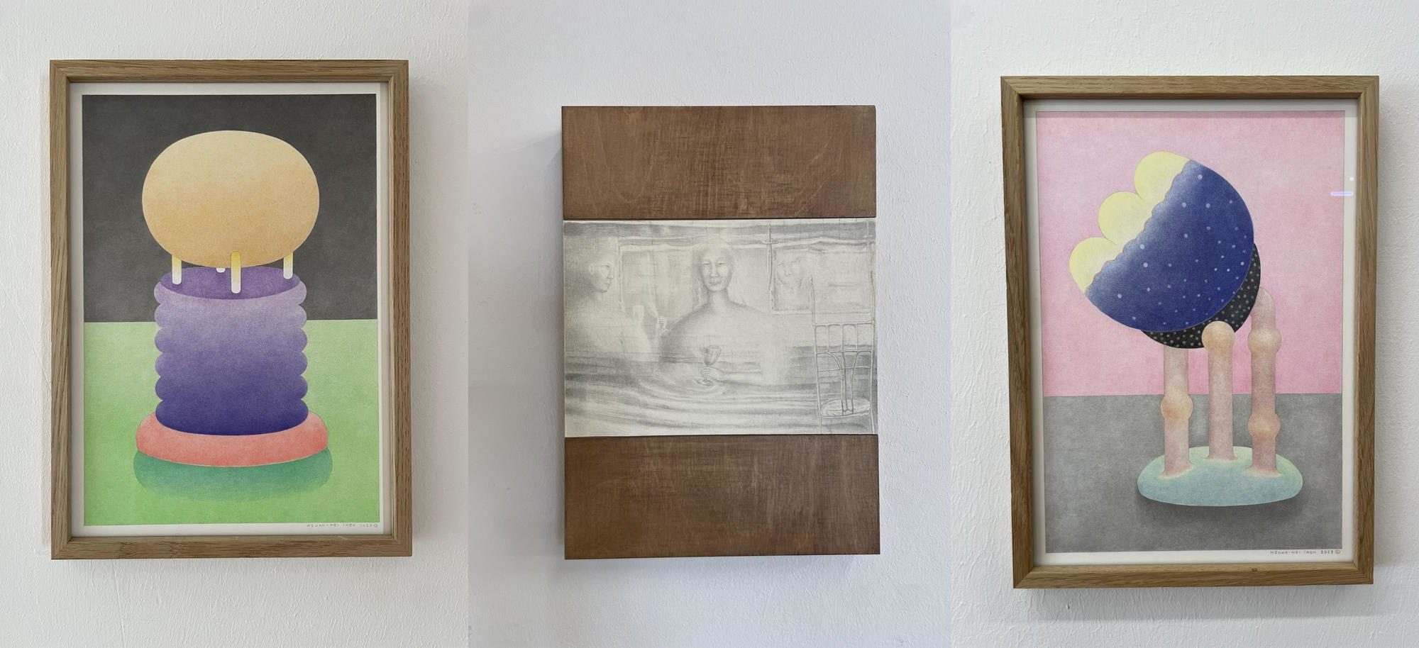
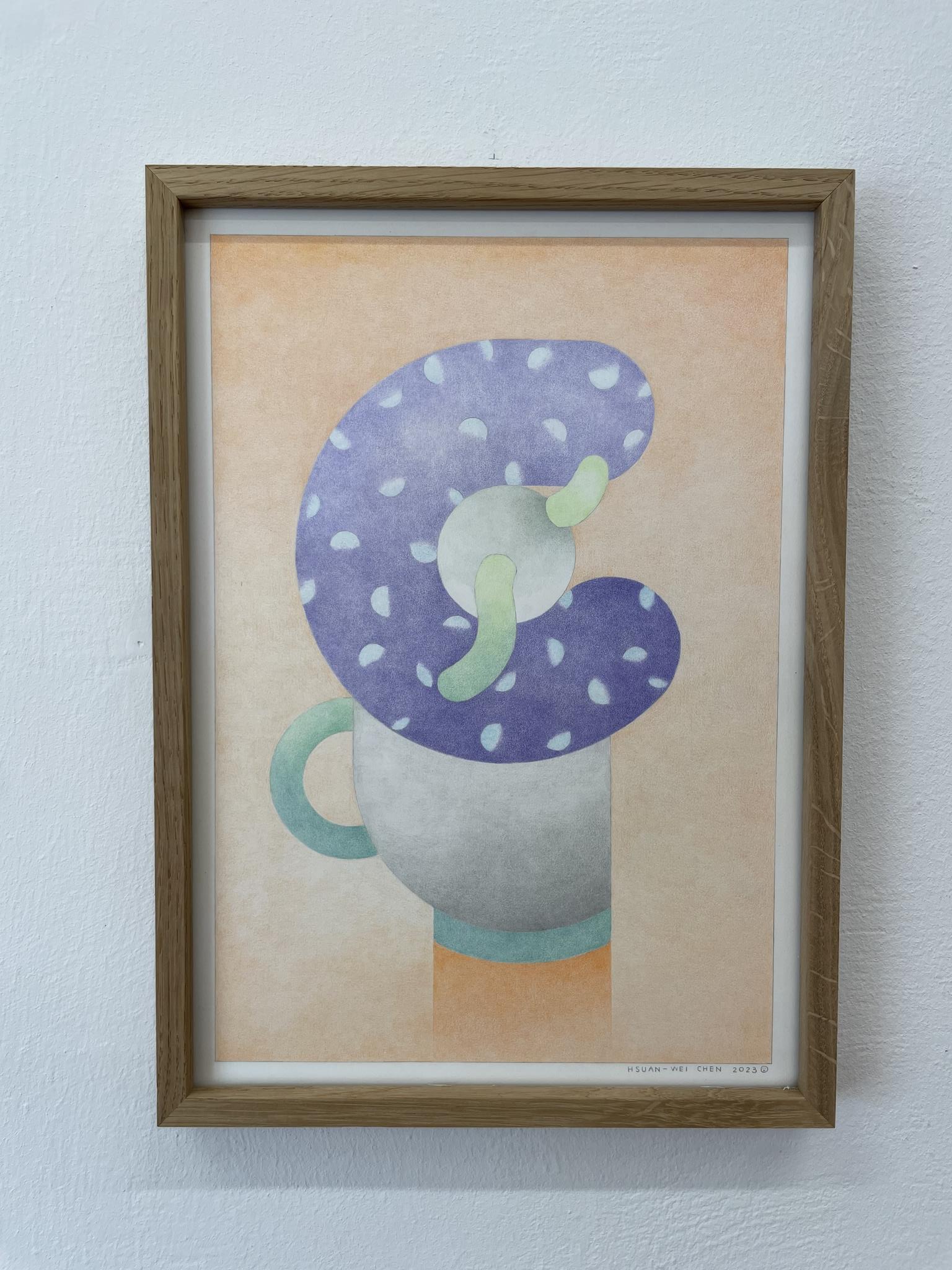
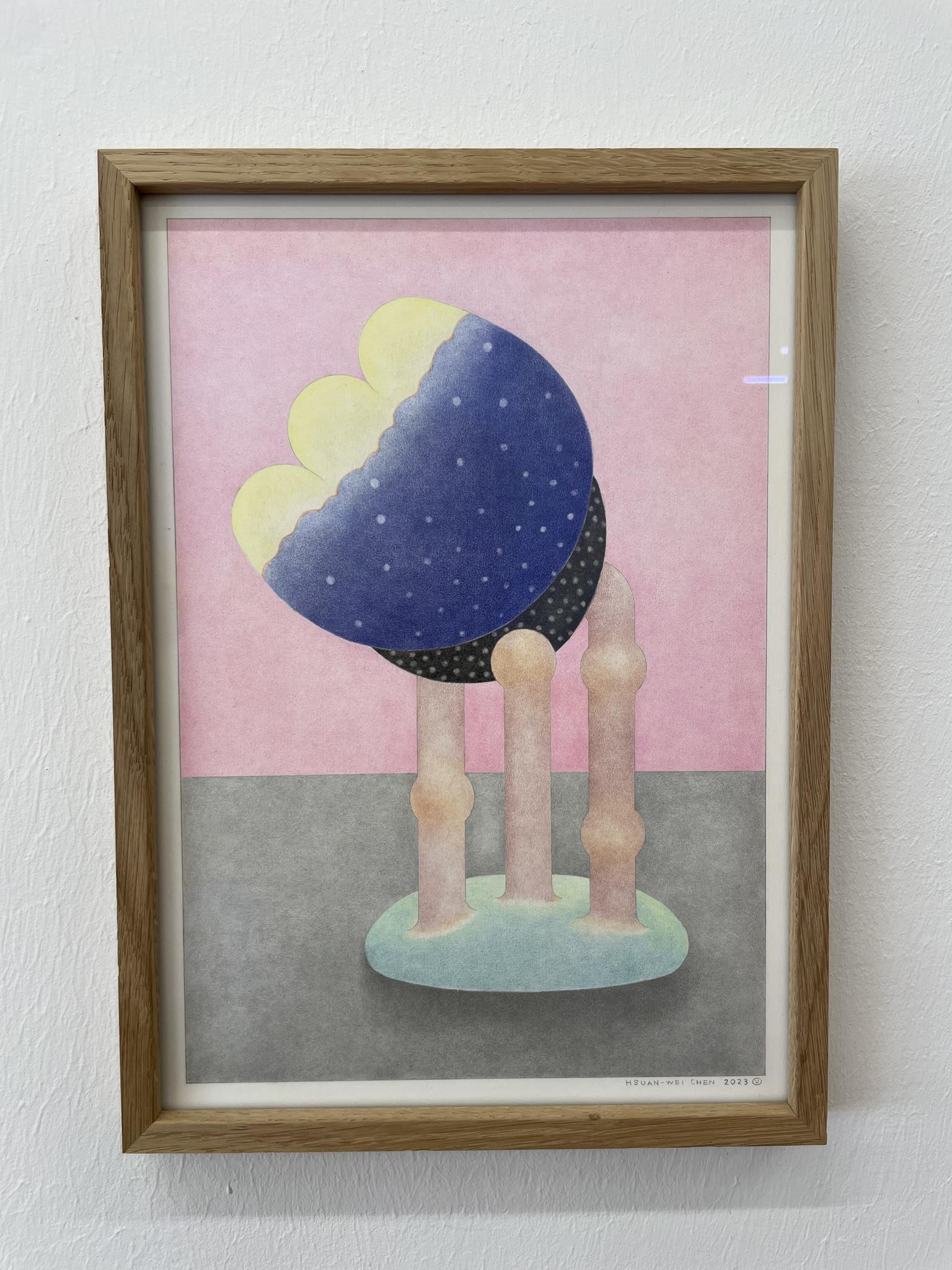
In her ABC series, JaJa unwinds the letters A to K of the German alphabet, which emerged from the Ugaritic alphabet in a long process of transformation into Phoenician, Hebrew, Greek and Latin characters, backwards, as it were, and transforms the letters that emerged from the abstracted pictograms back into pictorial forms. Her drawings, which result from the transformation of images into characters and characters into images, can be interpreted as tilt figures in accordance with Gestalt psychology and the cultural scientist Aleida Assmann, which literally demonstrate the tipping over from reading to seeing and the change from writing to image and back again. When we learn to read, after a while we no longer consciously see the letters and read over them. When we read over them, the letters and word sequences open up scope for interpretation. They awaken our imagination, let our thoughts run free and allow our reading to turn into seeing.
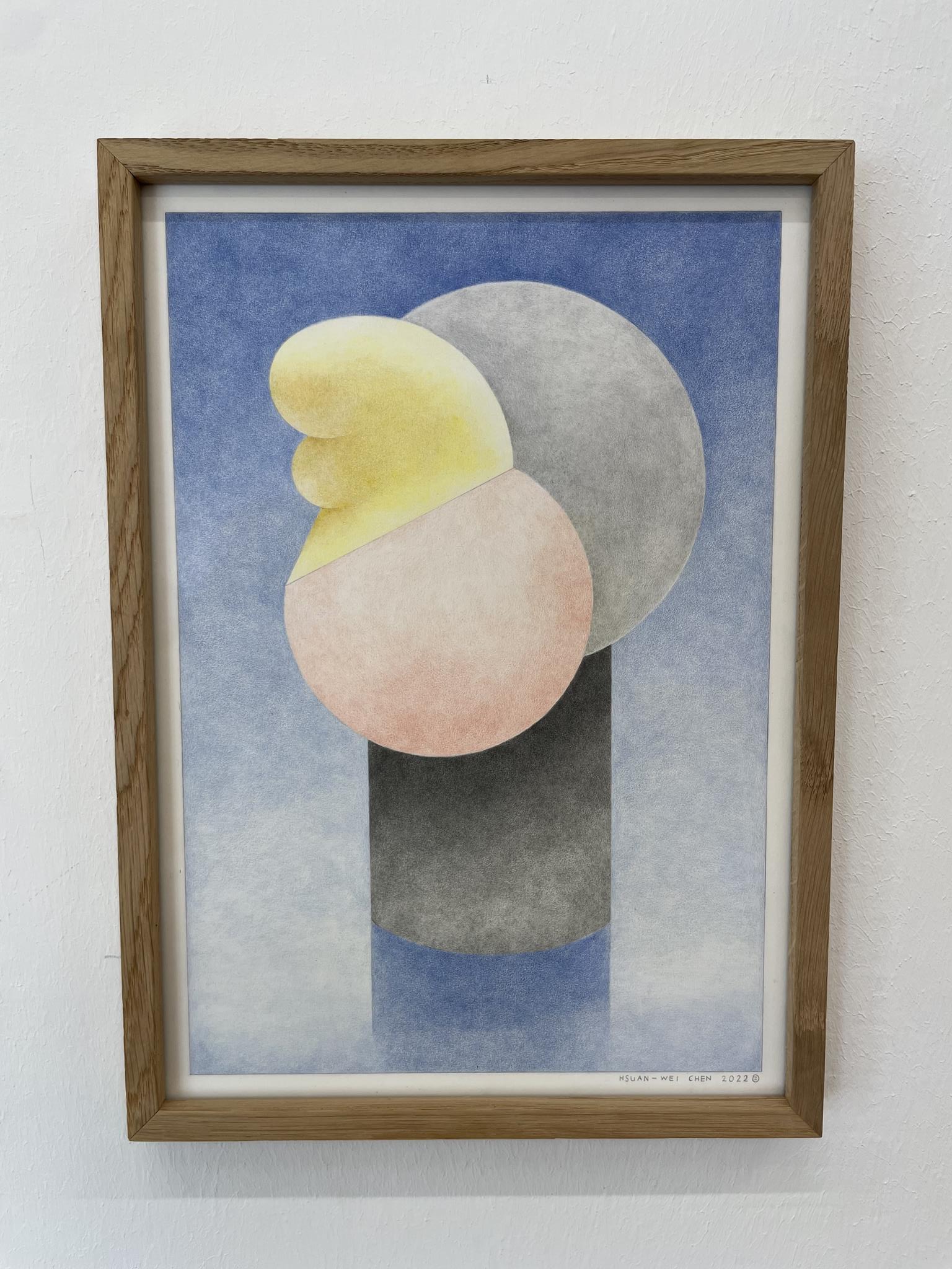
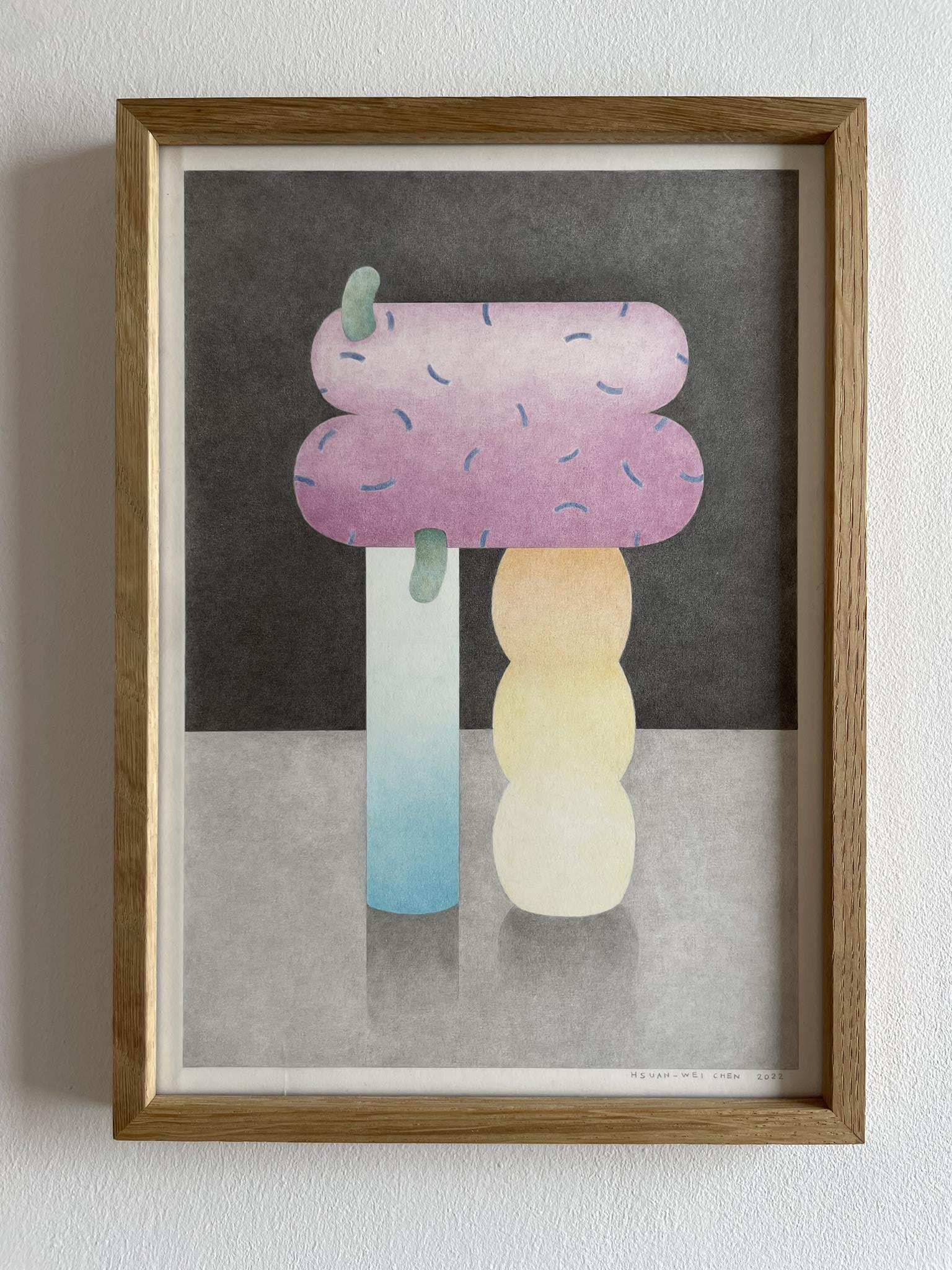
JaJa’s highly precise pictorial play, based on the anatomy of the letters, with abstract forms invented for each letter, entices us to follow this play in our minds; the coloration of the letter bodies she has found with color-saturated neon colors from Faber-Castell awakens our desire to see: the ochre-yellow dot on the letter I is supported by four thin columns whose neon yellow becomes darker towards the top. The ochre of the dot and the neon yellow of the columns are surrounded by a dark gray. The neon yellow columns stand on the upper end of a column shaft made up of six violet circles, which rests on a magenta-colored base. The magenta and violet of this column shaft is embedded in a light neon green, reminiscent of the underside of a green woodpecker or of spring meadows tipping into a light blue.
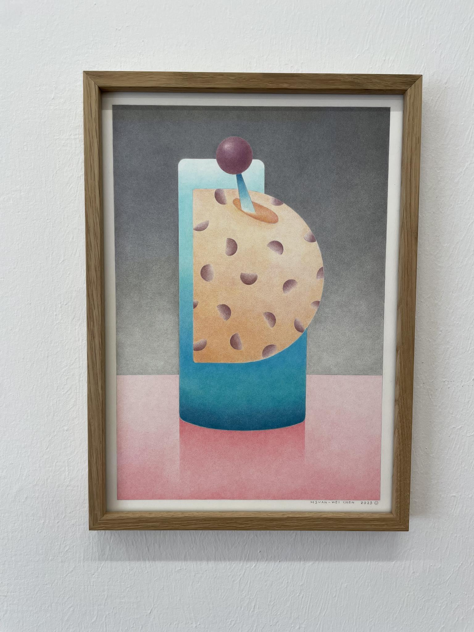
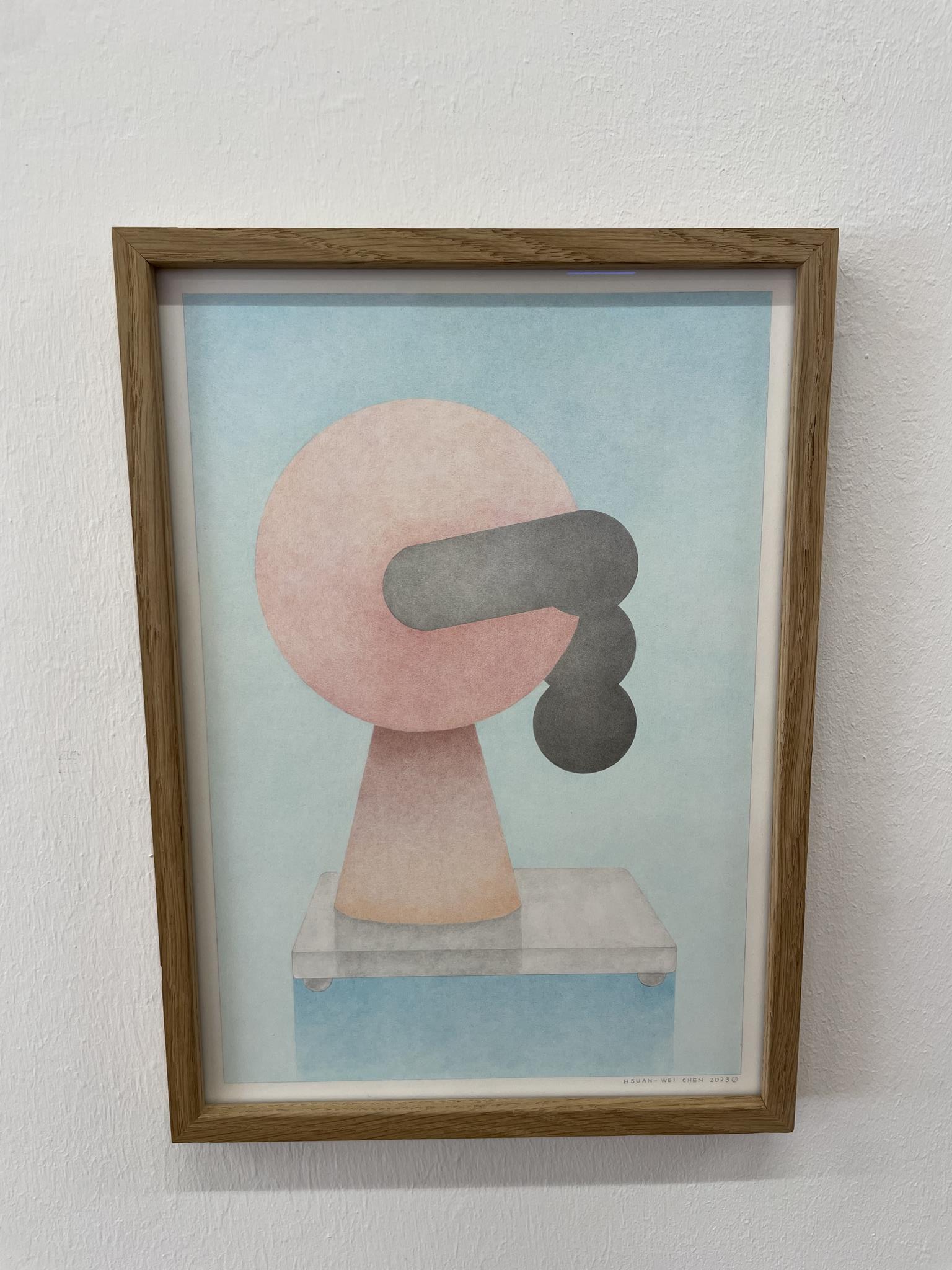
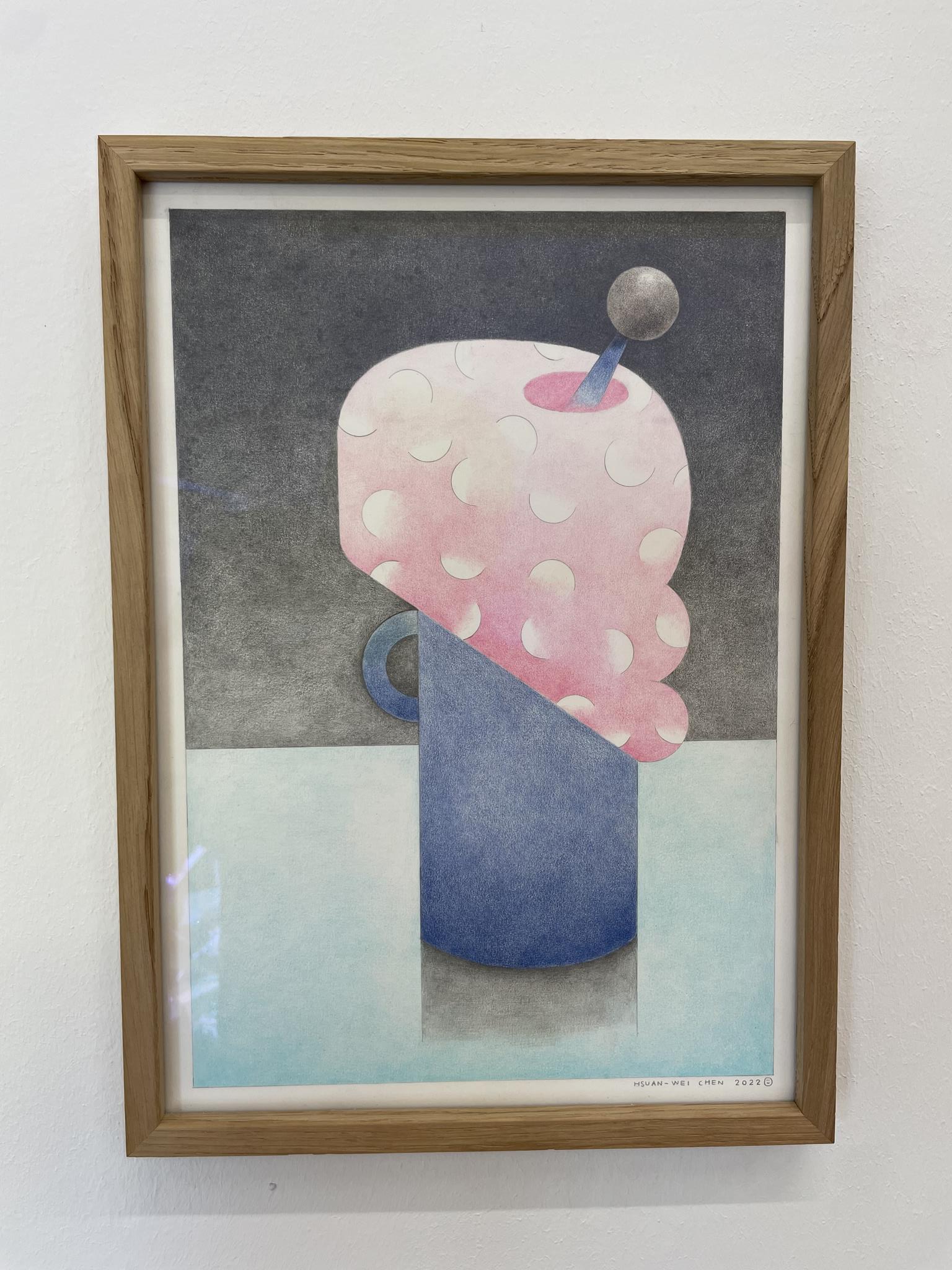
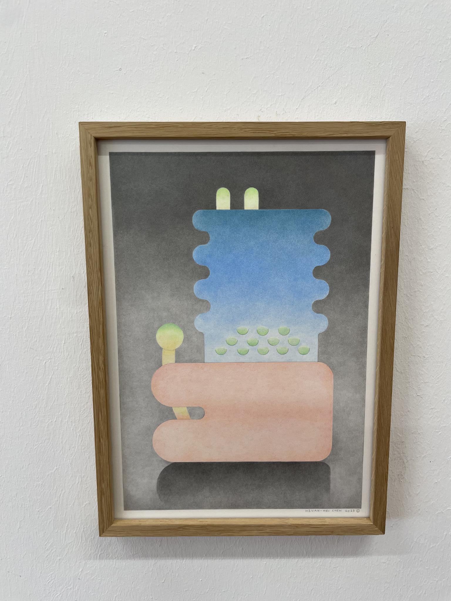
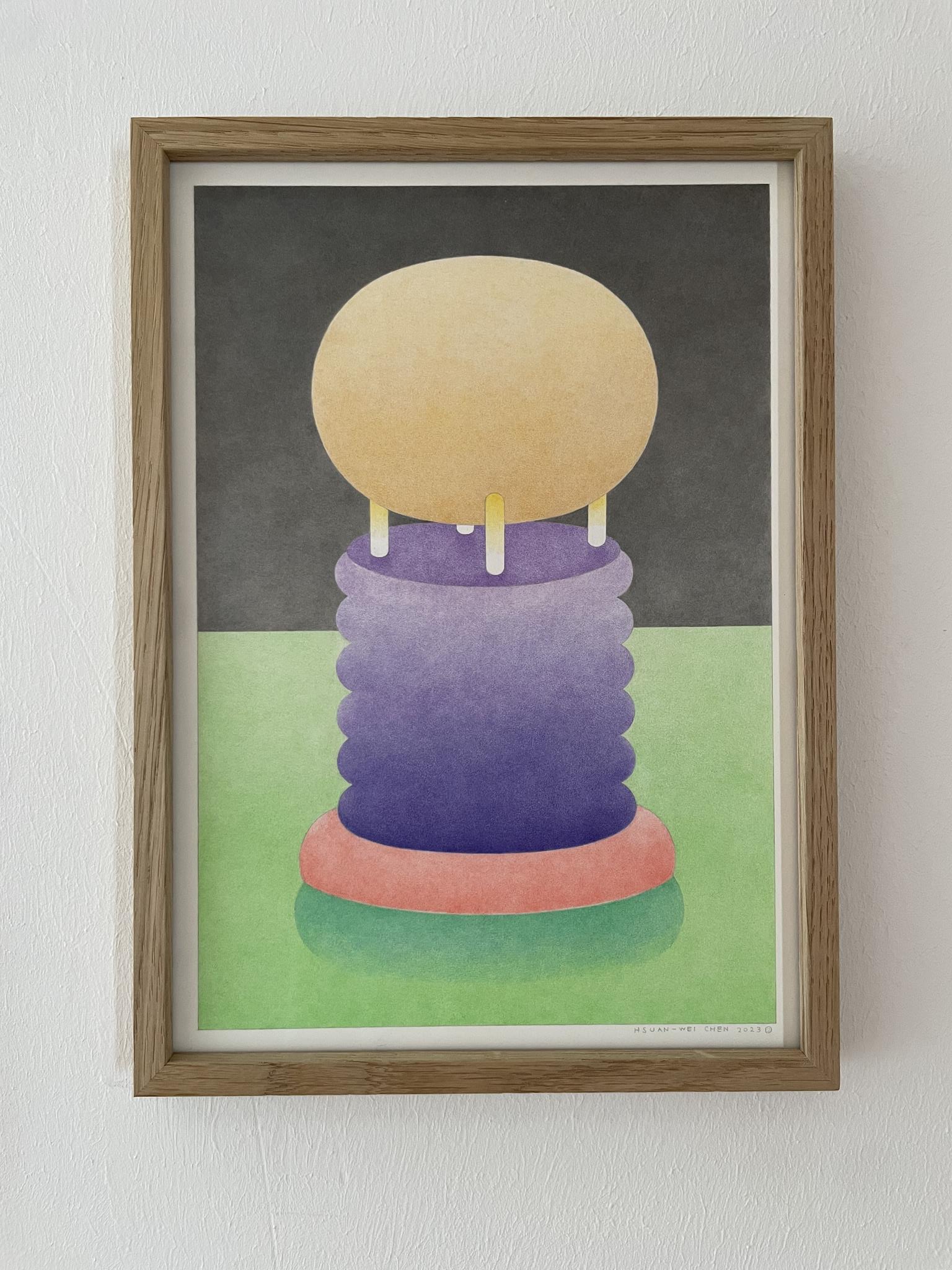
The violet of the letter I is picked up in the background of the letter J in a slightly redder shade. The magenta from the base of the letter I is transformed into a somewhat lighter pink in the body of the letter J, which in turn is countered by green growths on the lower arch of the J extending to the left and the gray in the middle of the vertically rising stem of the J. The pink is repeated a third time in the right smear of the letter K, but this time in an even paler shade. A black circle with white dots rests on the stroke.
The vertical base stroke of the letter K, which has been transformed into a narrow upright rectangle, is colored purple and merges into midnight blue at its upper end. The violet and the midnight blue are backed by the bright blue of a cloudless midday sky, which we also know from this year’s spring.
We can of course also associate JaJa’s drawings with the task of the rubricators in medieval writing rooms and in the early days of book printing, who usually marked the headings, initials, lombards, letter decorations and character fillers of codices, manuscripts and cradle prints by hand with lead red, but also with lead white, red and yellow ochre, indigo, lapis lazuli and gold. As with the rubricators, each letter in JaJa is transformed into a speaking image that can be viewed and, with a little imagination, read. Nothing, no color and no form is repeated in the sequence of letters that have become images. But everything is connected to everything else, shows its relationship and family resemblance and comes together to form an open whole.
JaJa dreams of one day filling an entire wall with similar works. It will therefore be interesting to see how her series continues and ends and whether, in one of her next series, she might also transform the alphabet that stood at the beginning of all alphabets, the Ugaritic alphabet, back into pictures. Whether the colors in Jaja’s drawings have a symbolic meaning can no longer be discussed here. This question would lead us into an open field that has been the subject of controversy since Goethe’s Theory of Colors and would require a separate contribution. But perhaps we can ask her ourselves after my speech.
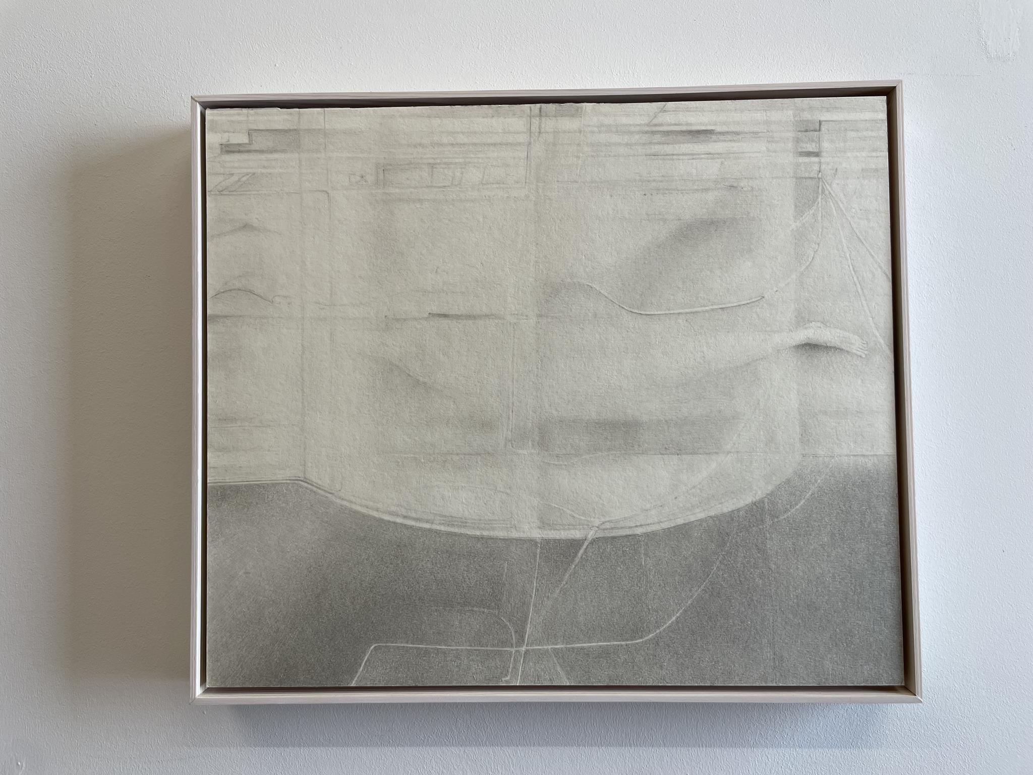
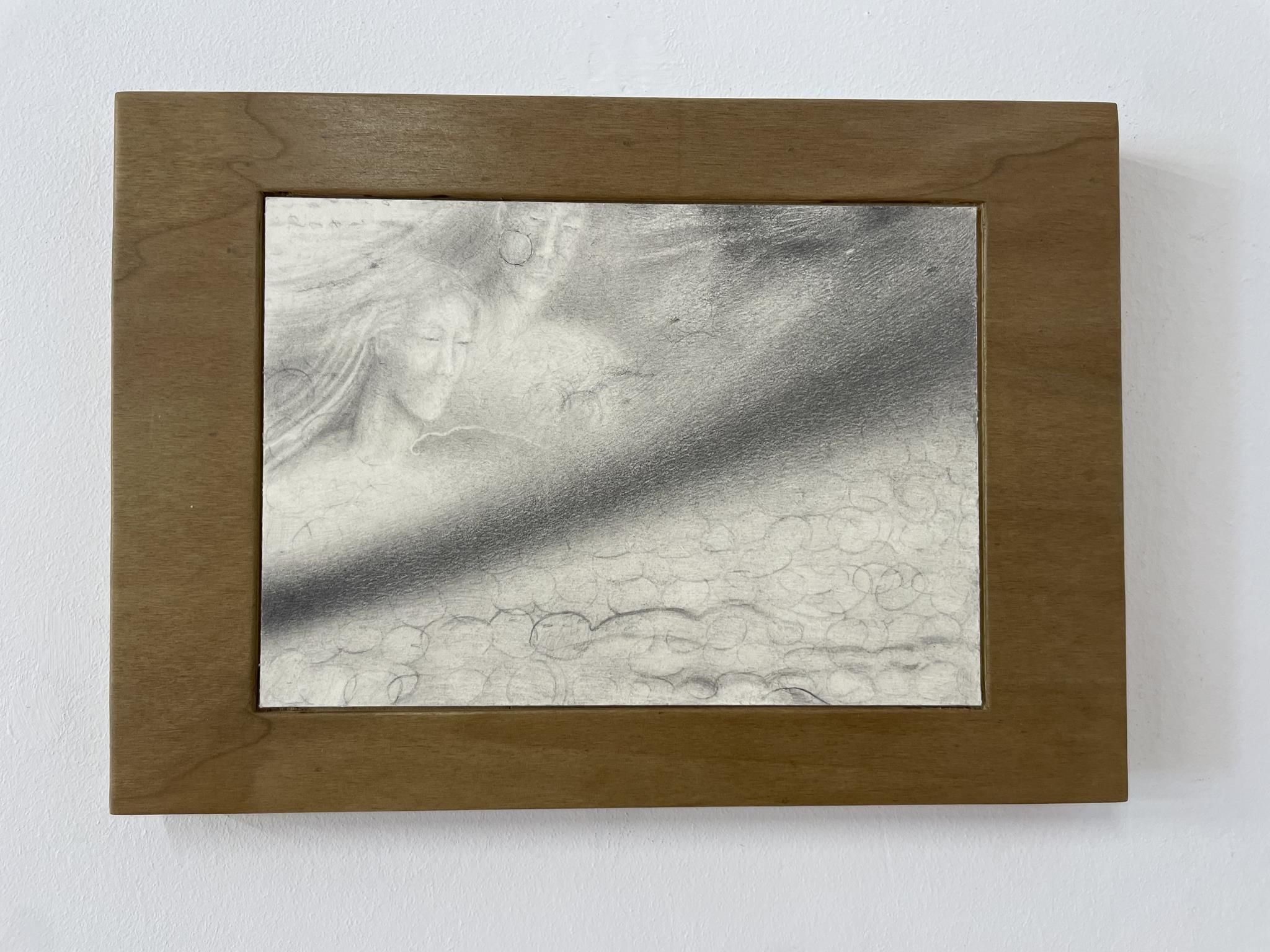
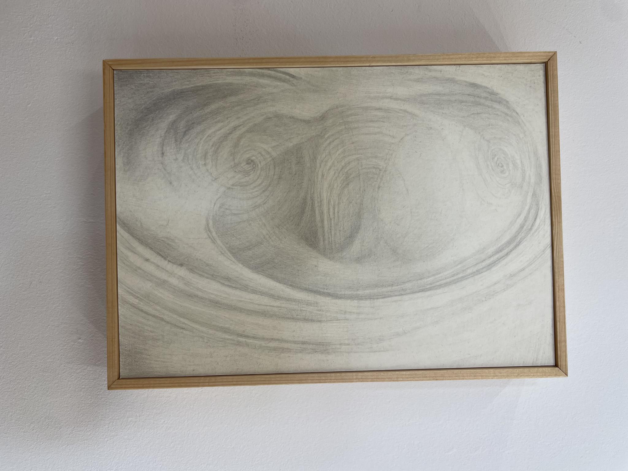
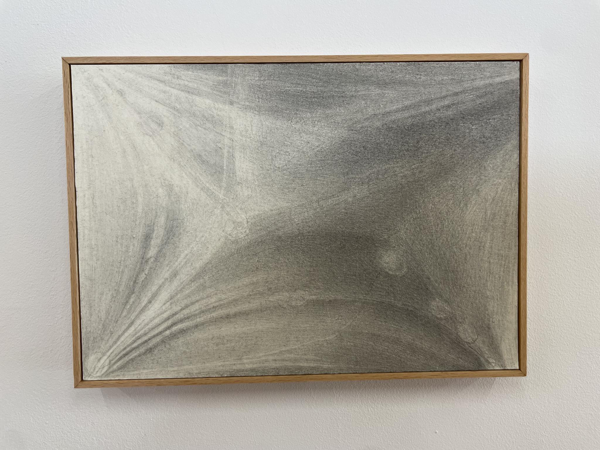
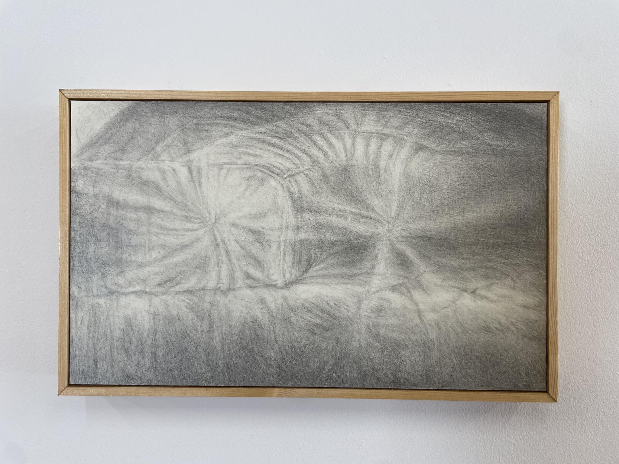
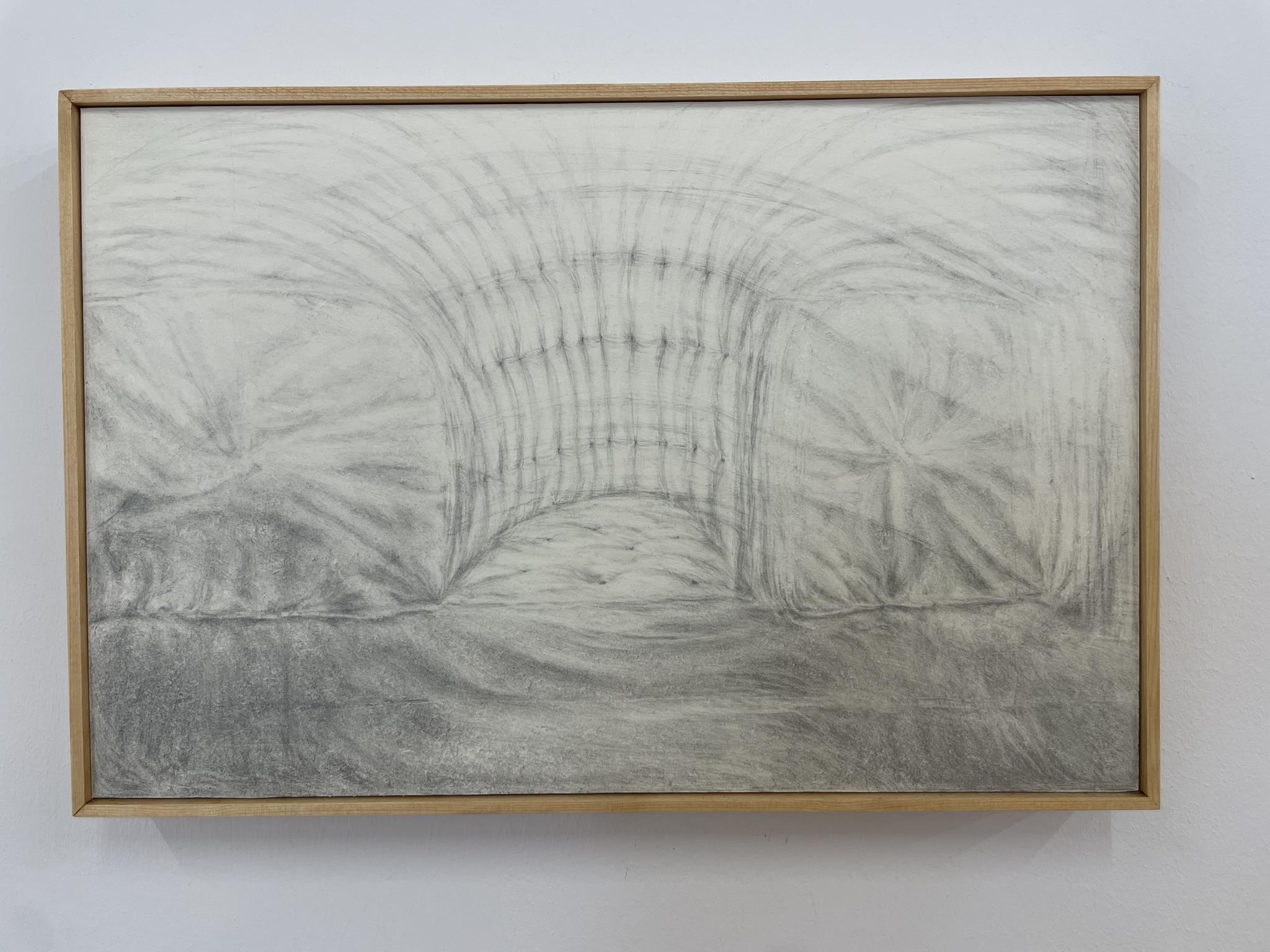
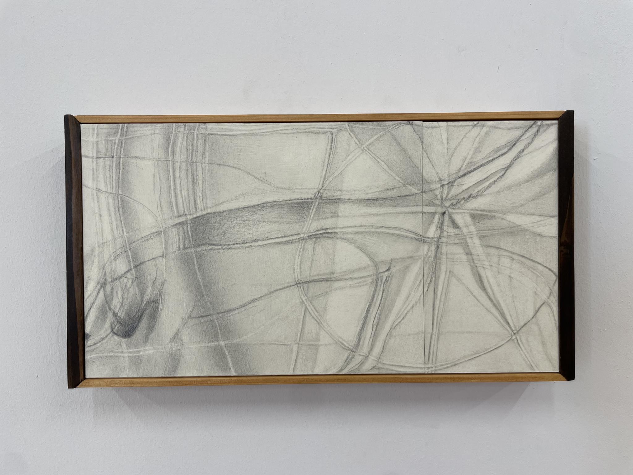
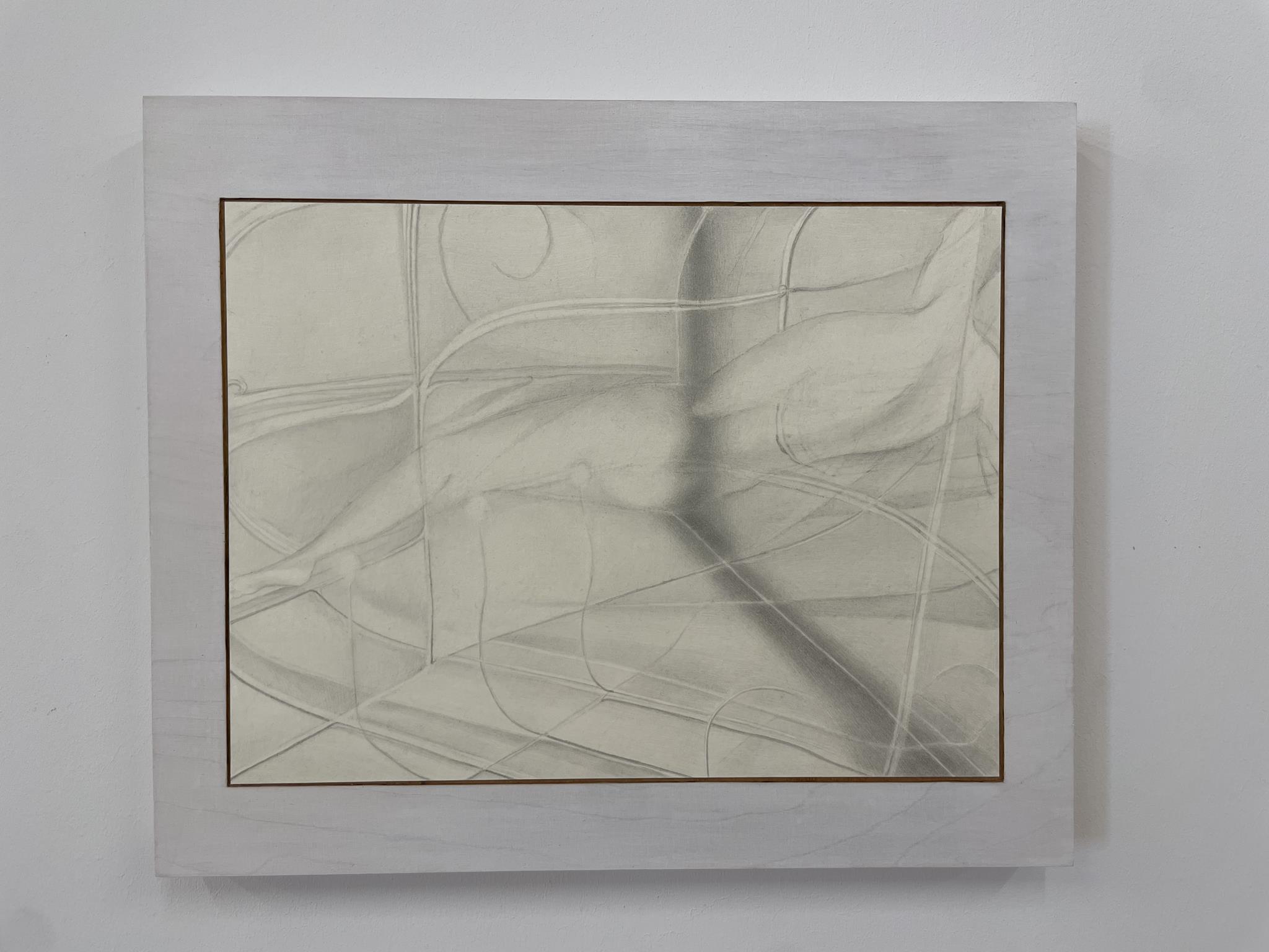
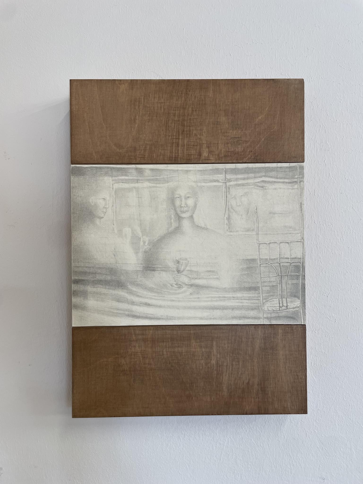
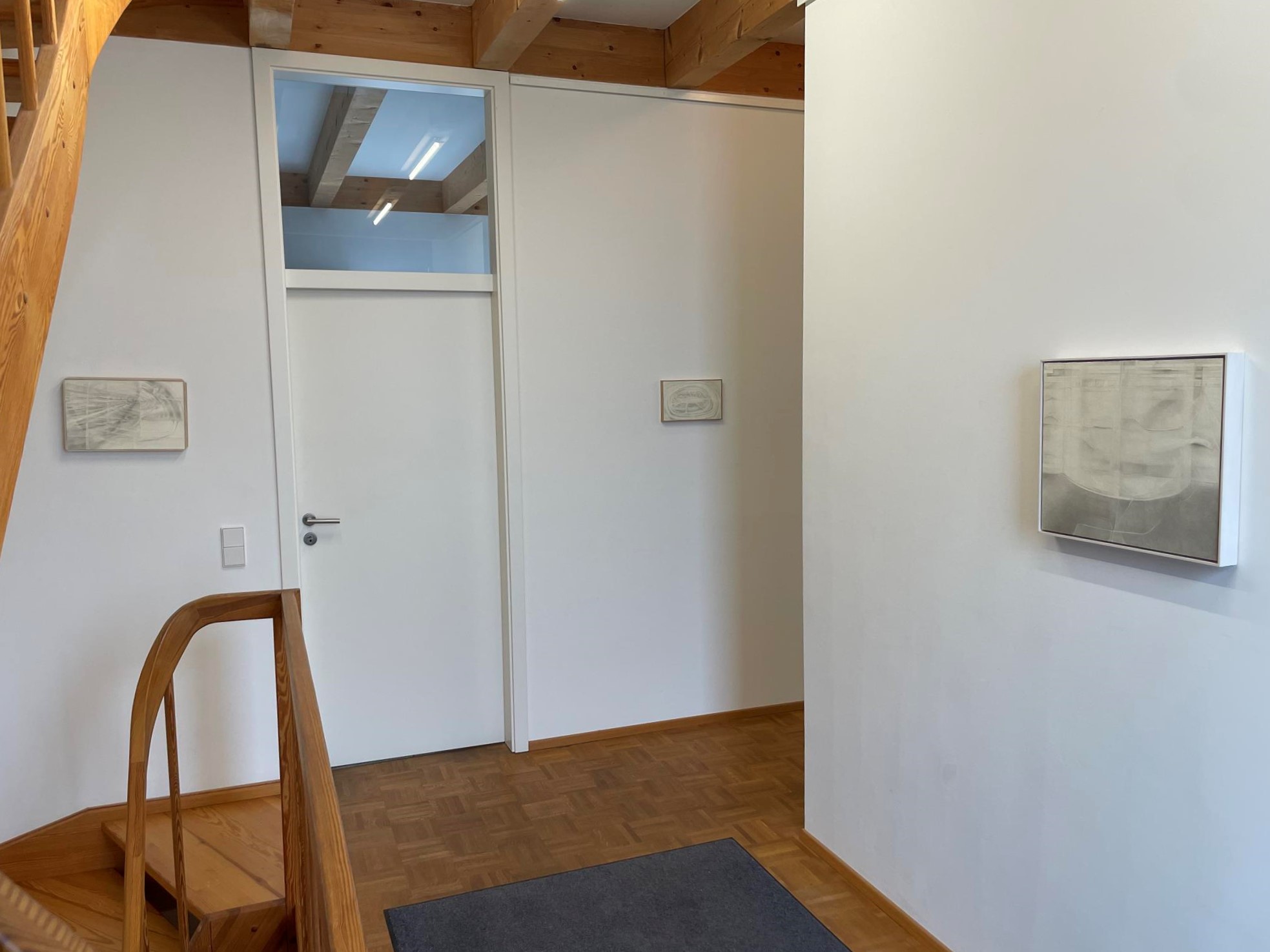
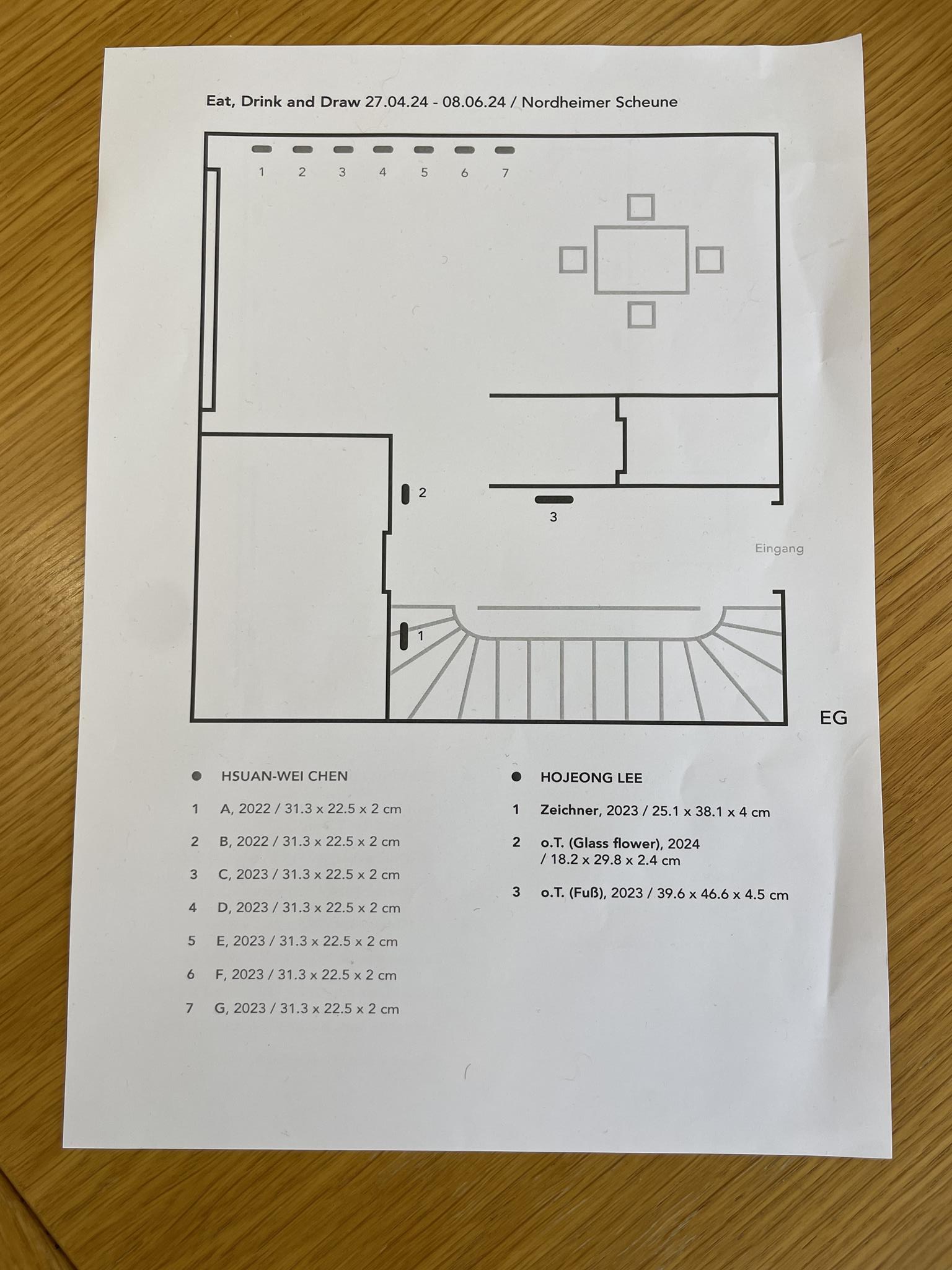
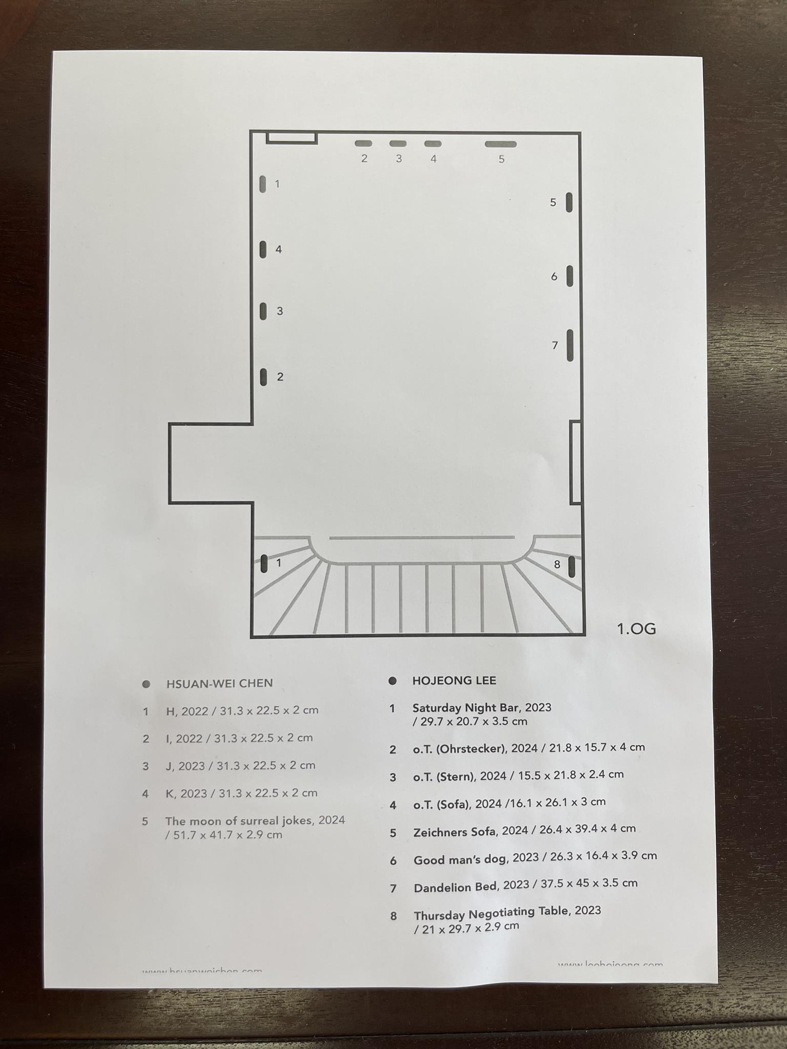
In Hojeong Lee’s black and white drawings, the question of the symbolic meaning of colors does not arise. She says that colors are too beautiful for her and that they overwhelm her perception. That is why she uses pencils of varying degrees of hardness and a black and white spectrum ranging from white to soft gray to deep black to produce her drawings. JaJa has given her drawings abstract titles following the ABC; Hojeong prefers a more concrete approach and suggests titles that remind us of our own experiences. Thus, the drawing in the hallway to the left of the kitchen door is called ‚Zeichner‘, the drawing on the right wall in the hallway ‚Fuß‘, the drawing above the staircase ‚Saturday Night Bar‘, the first drawing on the left wall of the gallery seen from the staircase ‚Ohrstecker‘, the second drawing on the left ‚Stern‘, the third on the left is called ‚Sofa‘ and the third on the right ‚Zeichners Sofa‘; the first on the right is titled ‚Dendelion Bed‘ and the second on the right ‚Good man’s dog‘.
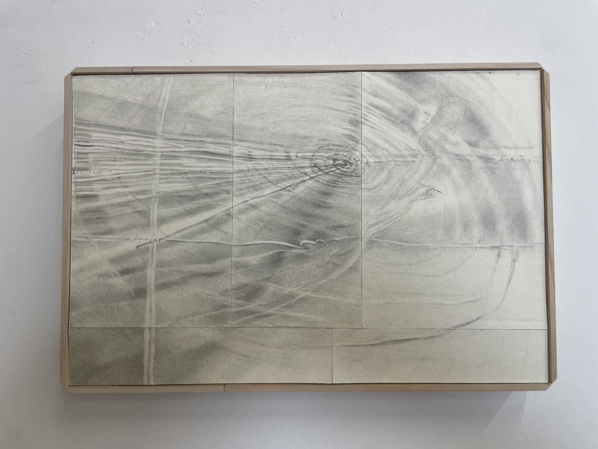
Over the past week, in preparation for my speech, I have looked at Hojeong’s drawings from a distance and up close several times and sketched them out in rough lines in order to understand them better. In doing so, I discovered the ‚foot‘ in the hallway that I had overlooked at first glance, and to the left of the kitchen door the profiled head with its shading, a hand with a pencil, circular movements around a center and a spinning disc, and finally the words ‚dancer‘, ‚beauty‘, ‚fine‘ and other words that I did not understand and that had become illegible during the process of creating the drawing. I saw two faces in the drawing above the staircase and two starfish in the drawing ‚Star‘. But the drawings ‚Sofa‘ and ‚Zeichners Sofa‘ stimulated my imagination and I came up with possible interpretations. But in the end they remained more or less abstract for me and left me just as perplexed as the drawings ‚Good man’s dog‘ and ‚Thursday Negotiating Table‘.
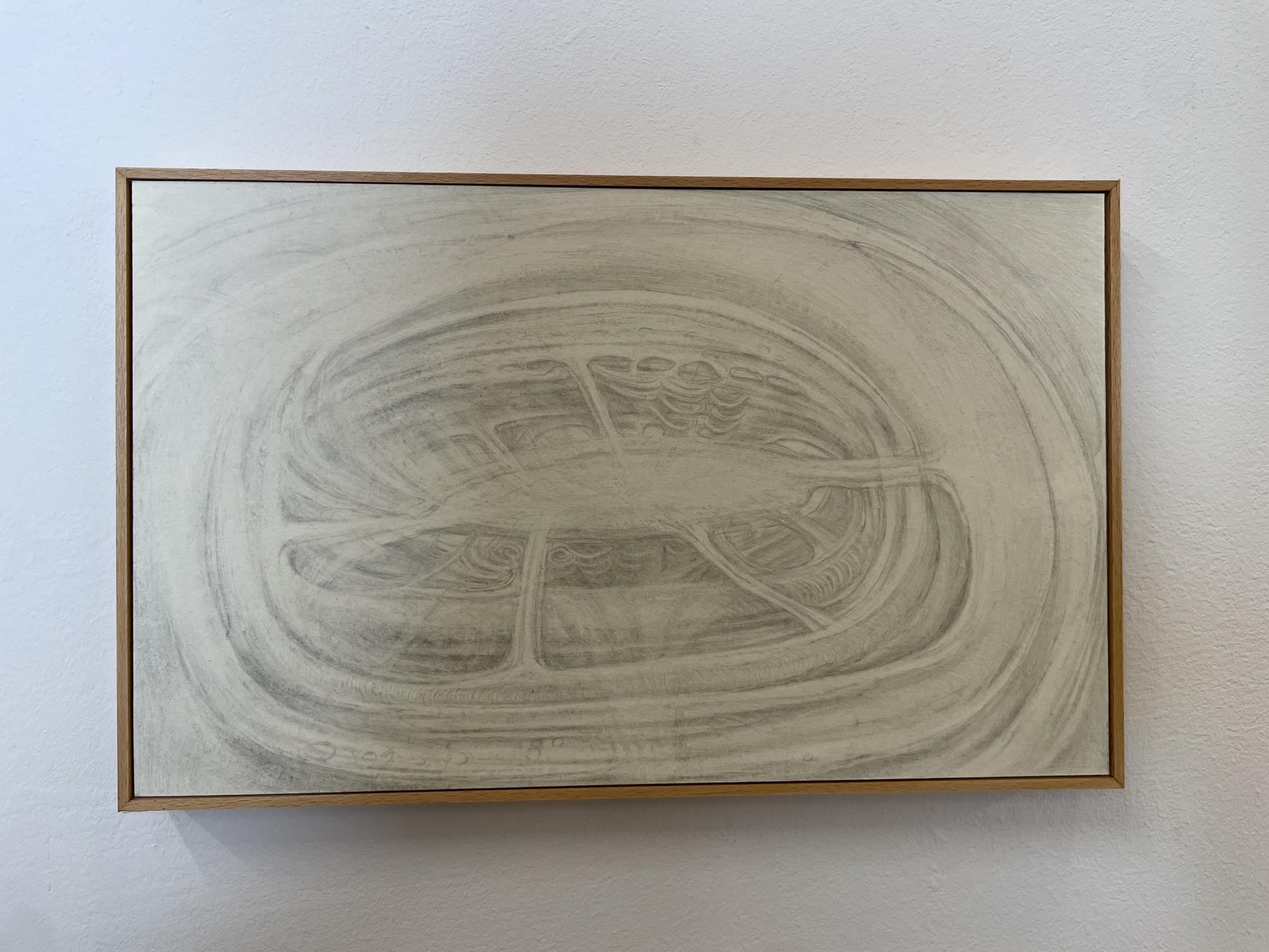
But when Hojeong sent me her titles yesterday and I was able to assign the titles to the drawings I had not yet understood, I understood them immediately and was able to read them straight away. With the titles in mind, the gray-black pictorial abbreviations for ’sofa‘, ‚dog‘ and ‚draftsman‘ found and chosen by the artist opened up for me and connected with my own memories of visits to living rooms with sofas from the pre- and post-war period, of our neighbors who walk their two dogs day after day along the Katzenbach and in the vineyards of Nordheim, and of my drawing lessons with Willus Brenner at the Robert Mayer Gymnasium Heilbronn. With everything that went through my mind, the black and white of these drawings has also come alive and become a part of me.
Since her childhood, Hojeong has allowed herself to be touched by grasses, plants, forests and the world around her, as well as by animals and people. To be touched and to touch herself is a form of communication for her, a communication that needs no words. This also applies to her drawings, whose pictorial composition is already part of the communicative process she strives for. For her, the multitude of lines layered on top of each other in her drawings is designed on the one hand for a good result and the feeling of ’now it’s good‘ – bad drawings are immediately torn up and end up in the wastepaper basket – and on the other hand for the viewer, whom she wants to invite to a conversation that can continue even in her absence.
Over the next few weeks, I have resolved to seek a conversation with the drawing ‚Thursday Negotiaten Table‘, because this work reminds me of negotiations with the Evangelical Church Council and my stepbrother that were not always easy. Perhaps this conversation will clarify things that have been overlooked so far. I am sure that you too could find a drawing in Hojeong’s work that is worth talking about. Finally, it should be noted that Hojeong builds her frames herself and sees them as part of her work. – Curator Helmut Albert Müller
INFOTHEK
![]() Artist: HSUAN-WEI CHEN – ??? – JA JA
Artist: HSUAN-WEI CHEN – ??? – JA JA
![]() Website: https://www.hsuanweichen.com
Website: https://www.hsuanweichen.com
![]() Facebook: https://www.facebook.com/hsuanwei.chen.5
Facebook: https://www.facebook.com/hsuanwei.chen.5
![]() Instagram: https://www.instagram.com/hsuanweichen
Instagram: https://www.instagram.com/hsuanweichen
![]() LinkTree: https://linktr.ee/hsuanweichen
LinkTree: https://linktr.ee/hsuanweichen
![]() Artist: HOJEONG LEE
Artist: HOJEONG LEE
![]() Website: https://www.leehojeong.com
Website: https://www.leehojeong.com
![]() Instagram: https://www.instagram.com/hoj.lee
Instagram: https://www.instagram.com/hoj.lee
![]() Curator: HELMUT ALBERT MÜLLER
Curator: HELMUT ALBERT MÜLLER
![]() Website: https://helmut-a-mueller.de
Website: https://helmut-a-mueller.de
![]() Facebook: https://www.facebook.com/profile.php?id=100005265189390
Facebook: https://www.facebook.com/profile.php?id=100005265189390
![]() Gallery: NORDHEIMER SCHEUNE
Gallery: NORDHEIMER SCHEUNE
![]() Website: https://www.nordheim.de/website/de/freizeit/tourismus/kultur/nordheimer-scheune
Website: https://www.nordheim.de/website/de/freizeit/tourismus/kultur/nordheimer-scheune
![]() Scheune Main Page: https://vagabundler.com/germany/streetart-map-heilbronx/nordheimer-scheune
Scheune Main Page: https://vagabundler.com/germany/streetart-map-heilbronx/nordheimer-scheune
![]() Photographer: ANTON MICHELS
Photographer: ANTON MICHELS
![]() Website: http://banater-schwaben-heilbronn.de
Website: http://banater-schwaben-heilbronn.de
![]() Facebook: https://www.facebook.com/toni.michels.7
Facebook: https://www.facebook.com/toni.michels.7
![]() Instagram: https://www.instagram.com/tonimichels
Instagram: https://www.instagram.com/tonimichels
RECOMMENDABLE GRAFFITI SPOTS IN HEILBRONX
>>> Olga Zentrum <<<
>>> Olga Parking <<<
>>> Neckarhalde <<<
>>> Erwin Fuchs Skatepark <<<
>>> Stedinger 1 <<<
>>> Sülmer 68 <<<
>>> Hasengasse 2 <<<
RECOMMENDABLE EXHIBITION SPACES
>>> Nordheimer Scheune <<<
>>> Kunstverein Heilbronn <<<
>>> Altes Rathaus Leingarten <<<
MORE STREETART MAPS FROM GERMANY
>>> Streetart Map Berlin <<<
>>> Streetart Map Bremerhaven <<<
>>> Streetart Map Frankfurt <<<
>>> Streetart Map Hamburg <<<
>>> Streetart Map Munich <<<
>>> Streetart Map Hannover <<<
>>> Streetart Map Heilbronn <<<
>>> Streetart Map Dresden <<<
>>> Streetart Map Wiesbaden <<<
>>> Streetart Map Rheine <<<
>>> Streetart Map Insel Poel <<<
MORE ARTICLES ABOUT GERMANY
>>> Graffiti Mag MAINSTYLE <<<
>>> Stencil Artist TONA <<<
>>> Das Dreckige Dutzend <<<
>>> Sculptor Pit Ruge <<<
>>> Dosenkunst – Jörg Rudolph <<<
>>> Sprayer CESAR ONE <<<
>>> Filmmaker Bernd Lützeler <<<
>>> Lupus Alpha – Calligraffiti <<<
>>> Firedancer Cassiopeia <<<
>>> Collagist DeePee <<<
>>> Sprayer ARTMOS4 <<<
>>> Painter Serkan Goeren <<<
>>> ElectroClassics – THE OHOHOHS <<<
>>> Painter Frau Fenster <<<
>>> Photographer Niko Neuwirth <<<
>>> Performance – Dirk Baumanns <<<
>>> Graffiti Artist RAWS <<<
>>> Hannover Glocksee <<<
>>> TO5Z <<<
>>> Andreas Weingärtner <<<
>>> Sprayer BERK <<<
>>> Nashi Young Cho Jazz <<<
>>> AnniMalisch Techno <<<
>>> Tula Trash’s Trashland <<<
>>> Performer Tamara Zippel <<<
>>> Painter Angelika Grünberg <<<
>>> Kreativnomade Sam Khayari <<<
>>> Toy of the Ape <<<
>>> Painter Jay Gnomenfrau <<<
>>> Photographer Tom Hoenig <<<
>>> Frankfurt – Pillar Paradise <<<
>>> Graffiti Weißwasser N3M <<<
>>> Bochum Kings Wall <<<
>>> Asylum Domjüch – Artbase <<<
>>> CD Kaserne Celle <<<
>>> Combo Karlsruhe <<<
>>> Hidden Treasure Festival Bremen <<<
>>> Urban Art Düsseldorf <<<
>>> Bergwerk Grube Wohlfahrt <<<
>>> Völklinger Hütte <<<
>>> Summa Madnezz <<<
>>> IBUG Flöha <<<
>>> Fritten Freddie <<<
>>> Dave the Chimp <<<